We’ve all stumbled upon a 404 error page that made us laugh, or evoked our admiration of its fanciful UX design. As disappointing and admittedly frustrating it is to hit a broken link, some sites have done a better job than others at creating a visually appealing or functional option for users.
To help marketers and webmasters understand both the value and pitfalls in 404 error page design, here is an analysis of four varied 404 error pages where the good, bad and ugly are all showcased.
What are 404 pages?
When navigating a website, it is easy to take a wrong turn. We make a typo, or visit an old link. That’s where 404 pages come in handy.
A 404 error page is also known as an error page. It indicates that a user reached the URL they requested, but the website was unable to find an associating page.
How do users arrive on a 404 page? Typos and old links in emails/ bookmarks make up 45.87% of 404 error sources. Broken links on a website are less prevalent as a cause of 404 errors, at just 17.58%. So what does that mean? Essentially, the vast majority of 404s generated on your site are out of your control.
Why do 404 pages matter?
Here’s the rub: only 23% of website visitors that encounter a broken link make a second attempt to find the missing page. That means 70%+ of people who reach a 404 error page will leave your website and not return.
No matter the reason for a 404, certain websites have taken the initiative to create funny, clever and visually masterful error pages to engage their visitors. However, while creativity is key in a 404 error page, the visual design of the page is only one facet. Exhibiting functional options to easily navigate away from the error page to other areas of the website are also essential to producing a useful 404 ‘not found’ page that drives engagement from site visitors.
Now that we understand why 404 pages matter, let’s discuss what you can do to make yours as effective as possible!
How can I optimize my 404 pages?
The fact is there are many different approaches to having a successful 404 page. Ask four different web strategists and you will get four different answers! But data shows that the best ways to have a 404 page that assists in keeping users on your website is to use the following two tactics.
Clean and attractive design
One of the most common complaints about 404 pages is that they haven’t been designed at all. If your 404 provides a technical message about URL path in plain text, the majority of your users are going to be confused (to say the least.)
Takeaways: Make sure the design of your page is attractive, easy to read, and matches the rest of your website.
Include clear next steps
The reasons so many users leave your website after encountering a 404 page is that they are often overwhelmed, or may think it is impossible to find the information they’re looking for. You need to show them that’s not true. Include a call-to-action to your site search bar, or an easy-to-access link to your home page. If you want to take it to the next level, check out Cludo’s Intelligent 404 tool for a feature that will automatically provide the user with links related to the page they were originally looking for.
Takeaways: Show users what to do after they arrive on an error page.
1. The Standard 404 (What not to do)
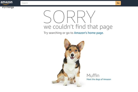
Let’s begin with a major no-no. This is the standard 404 page that is of absolutely no help to the end user. It holds no intrinsic value as it offers no useful information. Its design is merely utilitarian, with little to look at or appreciate. Webmasters and marketers should take note- this isn’t how you should treat your customers. Plus, beyond the back button, navigation from this page is nonexistent without any additional links to direct visitors to another page. This example was included to stand apart from the rest, as it is clearly the standard bearer of poor design and inadequate customer engagement. Too bad most of the sites out there are still going with this one…
2. Airbnb’s 404 page
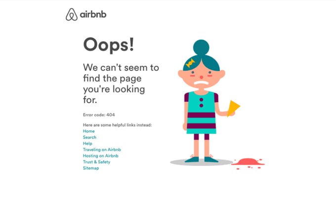
In a turn-around from the last example, Airbnb presents users with a clean and straightforward 404 error page. Their approach checkmarks several best practices. Its gently apologetic tone checks the first box, as it sets a mood for the end user who found a 404 error. It also receives major props for including additional links to popular webpages on their site. If those pages don’t cut it, then a link to their sitemap is also offered to access the precise page visitors desire. Plus, the GIF of a distraught little girl dropping her ice cream cone on the ground sets the tone nicely. Airbnb presents a decent 404 page that provides alternative options for visitors to navigate to a relevant page.
Airbnb doesn’t falter in its presentation or practical approach- it offers helpful links and a full sitemap. They’re on the right track to achieving a highly useful page that is aesthetically pleasing and is easily navigable. One factor that would establish Airbnb’s page as exceptional would be a site search input box. Adding search isn’t overkill despite having a link to the website’s sitemap. If the site had a responsive site search solution that displayed relevant search results directly from the 404 page, it would save visitors time looking for their desired page. A smart solution would exhibit results based on a user’s query and would essentially eliminate the need of a sitemap link altogether. That being said, all in all we say “bravo” to Airbnb for a well-designed 404 error page!
3. Wistia’s 404 page
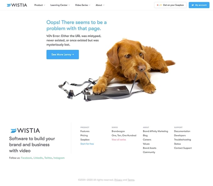
The 404 page from Wistia is extremely cute. The image features a dog tearing apart an old VHS tape, which is both a visual metaphor for a broken link that is old or nonexistent, as well as playing well with their digital video hosting product offerings. Beyond the delightful image, Wistia offers an explanation as to why a user found a 404. The description is thoughtful, helping non web-savvy users who are confused by their arrival at a 404 page.
A solid effort by Wistia, but there’s room for improvement. Their single option to navigate away from the error page is through the “See More Lenny” button which transfers users to their product page. This is a smart move as first time visitors will undeniably want to learn more about Wistia’s offerings, but it lacks additional options to move away from the page. The assumption that users just want to go directly to the product page creates extra steps for those who don’t, and the messaging gives the user no clear indication of where they are headed. Links to their homepage, a help center and other popular pages should also be listed. Ideally, site search integration with intelligent results should also be available.
4. The New York Times’ 404 page
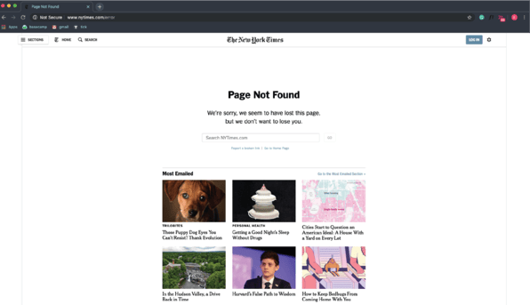
The New York Times doesn’t have the most attractive 404 error page, but it does serve up a few practical avenues. For one, it offers its visitors a full list of stories that they may wish to see, but unfortunately are not necessarily stories that are relevant to where the user was hoping to land on the site. On the other hand, they happen to be stories that are the most emailed, which means they’re probably quite popular on the site. It also incorporates an option that few sites have- the ability to report a broken link to a site’s webmaster. This option informs webmasters of 404s on their site and hopefully will result in addressing the issue. Another win for the site is a link that directs users to their home page. This is useful if visitors decide to try a different search for the information they were looking for. Plus, if all else fails, a link to the home page to read the latest headlines may be what a visitor was looking for in the first place.
The New York Times 404 error page does a lot of things right, but it’s not perfect. Quite simply, the looks of the page aren’t the prettiest we’ve seen. Despite its practical approach, the aesthetics of the page could be improved, while still following the overall website design. We’ve made a big deal about having a site search input on your 404 error page and the NYT does have this. However, the search functionality is a bit limited. It lacks an autocomplete search function and doesn’t correct your misspellings of even their most frequent writer’s names.
The NYT also has the right approach in offering their most emailed stories to readers, but this feature could be further optimized with an intelligent solution that displays stories that are related to the end user’s initial path. Even with these faults, the New York Times presents a useful page that gives visitors multiple options to find what they desire.
Alternate best practices for a 404 error page
You now have a better understanding of what makes a quality 404 error page based on the examples we’ve showcased. In order to help you optimize your own 404 page, we’ve assembled some other miscellaneous advice you’ll want to follow when designing a 404 page.
Basic
Offer A Sitemap: A sitemap is useful for the end user in case suggested results and popular webpages aren’t available. A sitemap simply offers the entire website in one place. It’s probably best to avoid this if you’re a larger website, since you’ll have plenty of webpages to display. If you’re a smaller website, then your users will find this an easy way to find the missing content.
Get Feedback: Consider including a link to submit broken links to the webmaster as well. A link to report broken links isn’t an admission of failure, but rather a solution to address the problem of 404s on your site. You’ll have a simpler time identifying 404s if visitors are cooperative in utilizing the feature.
Intermediate
Integrated Site Search: When hitting a 404, a properly integrated site search input would be highly useful for visitors. However, this does require a well thought out search implementation, as irrelevant results won’t bode well for the longevity of your customer lifecycle.
In this instance, a great time-saving feature is autocomplete, which finishes a search query for a user even before they finish typing. Another helpful feature to include would be a misspelling tool that automatically corrects a search query if it is misspelled. These tools help avoid further 404 error messages and lead visitors to the pages they need to find.
Quicklinks: Taking site search functionality to the next level, the incorporation of quicklinks will increase the seamlessness of the experience. A quicklink is a direct link that transmits a user to their requested page without even having to submit a search query or browse a search results page. The autocomplete simply suggests relevant pages as the user types, and they can opt to go directly to their desired page. The idea here is to save time and keep the customer on their way to the information they desire.
Advanced
Intelligent 404 Pages: The most seamless way to get a visitor to where they want to go, is to eliminate the basic 404 page altogether. Instead, the page can be reimagined as a useful conduit that predicts where the visitor wishes to go, rather than a destination itself. This is a significant improvement in a visitor’s content journey because they’re automatically receiving suggested content even when the broken link they’re looking for is nonexistent.
To make this happen, you’ll need a machine learning powered predictive engine, that will be able to detect where visitors intended to go and then present them with links to content that is pertinent to that specific visitor. The relevance of the content will increase over time as user behavioral data is analyzed in aggregate over time.
Utilizing 404 Analytics: A well implemented 404 solution should be paired with analytics that inform the user of how many 404s live on a website. This is information that many organizations are unaware of, but it’s essential to maintaining the long-term health of a site. 404 analytics should also tell you what content is well received on your site, as well as potential content gaps that need to be filled to increase engagement.
Wrapping it all up
Designing a good 404 page requires creativity in its design and approach, but the truly great ones give visitors the ability to easily navigate away from the error and find their desired page instead. By blending great design, a touch of creativity, and a well thought out and implemented technology platform, you can increase the stickiness of your website, even when your visitors hit a snag.
Our advice? Let your designer’s imaginations run wild, but also look to advanced technology solutions that can help deter 404 errors and drive visitor retention and conversion.
Looking for an out-of-the-box solution? Check out Cludo.
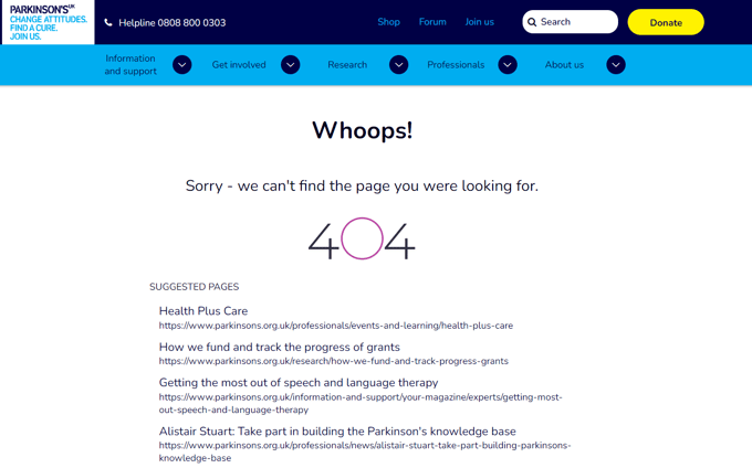
Cludo recently launched a first of its kind: machine learning driven 404 pages. The power of these pages has been proven- in a recent beta test with customers like Vodafone, The Bank of England, Parkinson’s UK, and The Children’s National Health System, Cludo’s Intelligent 404 pages moved 1,510 visitors from a broken link to a relevant page on average per month for EACH customer!
You can learn more about Cludo’s Intelligent 404 here, or simply try it out for yourself by requesting a demo.